Saturday, March 31, 2007

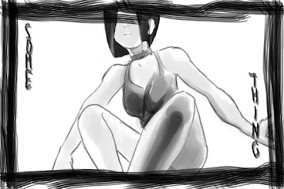
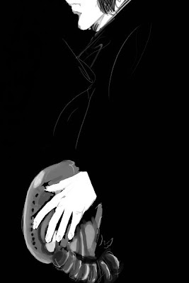
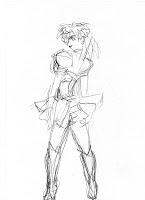
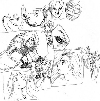
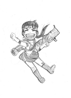
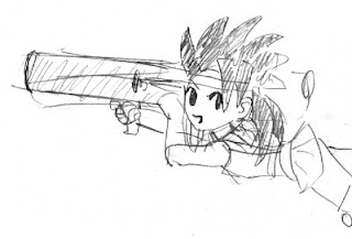
Something with lots of folds, Terra and wonky proportions

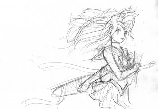
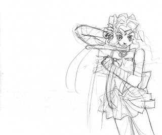
So... A rather elaborate pencil sketch.

It appears there's a space limit to blogger, so there's a limit to how many images this blog can take. Fortunately, I think the limit is 1GB, so it'll be a while till I reach it.

I'm currently away, technically, but I have my pens, paper and a scanner and my graphire3 with me, so there should be art - unless I'm very busy, but that's as per usual anyway. However, I won't be working on the comic while I'm not at home, so it'll be mid-August, er, April, before we can expect that.

I'm not sure what I'll work on - maybe some more pixel stuff for GDM, maybe sketchydoodles, or some animation since I have my graphire3. We shall see.

Thursday, March 29, 2007

Terra in Pixel Land


64x64 pixel, 20 color Terra portrait done with free version of Graphics Gale. A quite nice piece of software.

I was mainly inspired by this tutorial here.

I'm really not very good with pixel graphics. I mean, I'm better than I was back when I did these two for GDM, in 2003:
Blown up to double size, I think.

There are some things I like of them, but they're definitely not as clean and neat as sprites are supposed to be. They're also terribly asymmetrical. Still, they probably fulfilled their purpose of testing the adventure mode. Maybe.

Chesu does a much better job, all in all. I mean, sure, he uses some pre-existing sprites as a starting point, but I'm not going to hold that against him - I mean, it keeps a consistent look to the whole thing. Not to mention how incredibly tiny they are... I think they're 32x16 pixel sprites, originally - maybe due to the hardware limitations of SNES. These days there's no limit to what size one can make them sprites.

Ah well, I like the flow and energy in my asymmetric, sloppy terra sprites. I'm sure they're actually salvageable with a bit of work, if it ever becomes necessary.

Wednesday, March 28, 2007

Something - thinking in widescreen


There is no deep meaning to this picture.
These aren't the droids you're looking for.

The top row was doodling while watching sin city. Only the first one actually references something from the movie - the pose, I think. The rest....

I cut two pieces of thicker paper in two different sizes, with 16:9 proportion, more or less. I made squares, I filled squares. I started out thinking of stuff that would go to a hypothetical GDM / NETTG:TEY opening animation, but I sorta digressed from there. One of the drawings was going to be "Cats in my head", but it looked better white, ( no real - or animated cats were referenced when drawing this, ) so I left it white. There's also no crescent. I have trouble remembering to draw the crescent, every time I draw something that has it.

Tuesday, March 27, 2007

Playing around with pens in class


Don't worry --- it was a boring class.

Y'know, I really should write longer posts, but I'm... well, I could say I'm not very talkative, but that would be a complete and total lie. I can go on and on about stuff from time to time. Due to the way I write these posts - on the spot, spur-of-the-moment and such - I may not think of anything - I mean, this is an art blog --- and I use "art" since it's shorter than writing "drawing/painting/digital drawing-or-painting/animation", not in the sense that there' any sort of divine inspiration gleaming behind it. I see art as a craft -- nevermind the occasions where I talk of feel or flow of something-or-other. It only seems like magic because I'm not advanced enough to understand the science.

Before I went digressing, I was going to say, that as an art blog, the post is really just a vechile for me to go "Art here, come look" so there isn't really much point in writing a very long post to accompany the image --- after all, a picture is worth a thousand words, right?

Anyway, pens are fun - they're more organic and whimsical than doing stuff digitally --- of course, you cannot fix any mistakes, but that's part of the fun, in my opinion. I like the large black areas - the scanner is quite merciless there, the variation in blackness isn't quite that large in the original.

I'm not very familiar with using pens, so that's why it looks so horrible... which is to say, I'm not very fond of this picture. I did like doing it - looking at it, not so much. The fingers look nice and strong, though.

I haven't mastered my rubble drawing skills yet. I wonder if there's a guide--- Surely there is, there's a guide to everything in the internet, right? I just can't find it right now. If someone finds one, drop a comment, okay?

Okay, I have, like, zillion Firefox tabs open right now. Random link: MakingTheFilm.com

Three Panel Soul is the new comic by Ian McConville and Matt Boyd.

I think it's time I resumed work on the next comic, by the way. But I have so much schoolwork. Well, I'll try to get some work done, on something-or-other.

Oh, and I finally finished "American Gods". I spotted a cameo of Delirium there, as well as a homage to Death. I'm sure there's more....

The book mentions a silent movie era star called Louise Brooks. Youtube has some videos, and... well, I'm not sure if it's a silent movie thing or what, but there's this sort of exaggerated way of moving they seem to use, which relates to what I've learned of animation. Interesting.

Animation nut!

As you may know, I dabble from time to time with animation. A while back I uploaded my old stuff to university's server, but I didn't make much noise of it. However, now there's a new bit of animation - done with PlasticAnimationPaper Free, so I thought I'd share:

Animation
New animation of trying to play DDR It's encoded with Xvid. ~80k or so.

Monday, March 26, 2007

Something - Terra


When in doubt, draw Terra!

I actually redid the eyes - they were horribly mismatched initially. And... well, stuff. Too tired to elaborate.

Saturday, March 24, 2007

Something, at least it isn't a bunnygirl.


Blargh anatomy.

Only reason I post this is because of the inappropriately chested bunnygirls. Which is another weird reference that most people won't get. Bad habit.

Pose... superheroes... Blinky Productions...

Fanfilms and indie moviemaking is quite interesting. Pink Five and all that.

Friday, March 23, 2007

Something / Old Stuff #10! Stylin'!


Blargh.
Not quite monosyllablous yet. Getting there, but... maybe I find it easier to write these days, so I don't get there as easily.

Once upon a time, we thought it would be nice to make a desktop image. We chose Sailor Stylin' as our subject. We never got anywhere with that, really.

Maybe one of these days, or something.

First one: Not horrible, weird pose.


Second one:

This doesn't really look like her at all. Kobayashi.
And if that made sense to you, then you're probably me.


Third one: Quite good, also similar idea was used in the valentine's day image. (it's in the extras section on nettg.com.)

...

Aww, now I went and liked 'em. Oh well.
...I mean 'linked', but, that's amusing, too.

Linkage:
Eisu has a new comic!

Thursday, March 22, 2007

Something not yet monosyllablous.

I like that style of painting hair.
I need to draw more complex stuff, not just faces. The line quality is ugly, but that wasn't the focus here, really.

I like framing stuff, it seems

Did draw something with pencil, too, while watching Sin City (recut)
Nice, overly Film Noir movie, that. Interesting style of SFX used.

*edit*
dumped a bunch of event files temporarily on university server ( mah website ) for those who are OpenCanvas enthusiasts, or something.

Something: A word which I overuse waaay much. It's kinda like parrots and limited wossname, vocabularity.

Wednesday, March 21, 2007

Something/What?Where?How?

Randomness, playing around in OpenCanvas, bit more realistic / american comic style.

I like the hair. I was reading casstoons today 'til I was done, so that may have influenced me there.

What else? I need to enter study mode, so I should be relatively silent ( if I'm not, then I'm not studying hard enough. ) I will draw something here, but I probably won't rant very much, and the drawings may not be very inspired. Unless I'm not studying hard enough, but then again I gotta do what I feel like, up to a point or I'll start to procrastinate, and drawing is better than procrastinating, so... or Something.

Sunday, March 18, 2007

Something in black and white, random fanart.


Trying to think in shades, spotting blacks and such. Drew very distinct muscles again, then thought, I might as well make it a certain easily recognizable character. And such.

JPEG-artifacts ate the third arbyfish, so here's where it should've been:


It's like, subtle or something. JPEG-artifacts kinda killed it, though... Oh well, cannot be helped.
For a change, today's painting was done in Paint Shop Pro 9. I probably should try doing some chiaroscuro ( which sorta sounds like shirokuro, ) with pen and inks - I'd be able to pay more attention to the details.

Well, it's something. I can always draw Something. and Terra, it seems.

Doodling #6 - maybe I need a new tag for these?


I have become proficient with child-Terra - I often draw her when I can't think of anything else, or when warming up.

Muscled guys are a good way to figure stuff out with anatomy and tension and such, thus they pop up from time to time. All that easy-to-follow anatomy...

You'd probably miss it, but my favourite here is actually the gesture drawing of a handstand hidden on the right side of Chibi-Saiyajin... But all in all, I like a lot of stuff here.

The NETTG-related stuff came to be as I was done drawing all that weight and posture and anatomy stuff, thinking of Terra who can pull off supernatural strength stunts if need be. ( Uses energy, according to my calculations. ) Then I continued thinking of good drawing and how every figure should basically be recognizable by it's silhouette, so I drew Chibi-Saturn --- who also had a lousy pose, and there ya go. Pose-wise, Chibi-Saiyan wins.

Saturday, March 17, 2007

Something from the world of high adventure!


Ahh... the Unnamed City(tm). With the obscenely powerful plot-device Necromancer, and magic shops with all sorts of wonders.

The guy in the foreground is the demon hunter, wossname, um... Vangeres, according to my notes. ( Sorcerer with bane magic & planar substitution, or something like that. )

Of course, when the players arrive, it's winter instead.

Hmm. Forgot to put some rocklike colors on higher areas of the mountain to the left.

I could swear it's once again a full shade darker than in OpenCanvas. Perhaps it encodes jpegs somewhat funnily? Oh, well.

I've hidden three Arbyfish into this picture, see if you can spot 'em!

Friday, March 16, 2007

Something is frying my brain


My brain; Why won't it stop the frying?
Frying! Oh, the frying! It fries! Hindenburg! HINDENBURG!

Thursday, March 15, 2007

Such a tiny concentration of power

Dark, innit? Looked lighter on a gray background... oh well.

Random GD-ness, not much to say -- a failed experiment in the use of light, I guess?
I... I am not bold enough. ;_;

Problem with dark-on-dark... there's no silhouette. Hmm.
Fail, fail, fail, fail, fail, fail, fail, fail...

Wednesday, March 14, 2007

Something moody in black and white

My brain is melting. Composition is neat, due to "darn, can't fit the face there... oh well."

Fan-art, for those who know --- and most should. Quite crappy, and there's my usual anatomy problems popping up with the fingers, but let's see how well YOU draw when it's your brain that's melting! Hmph!

looks sorta Clone.Manga-ish. ( excellent artwork there, might be NSFW, depending what you're reading. )

By the way, I just discovered Invader Zim. Oh dear.

Tuesday, March 13, 2007

Old Stuff #9: Sometimes, women are from Mars.


Ahh... designing the Elder Senshi.
That... is probably the first take on Elder Mars... or I just named a random sketch as such. Or possibly, Ben went and said "This one looks like Mars."

...He probably didn't, considering who Mars is based on.


In any case, here's some more sketchy. Mars still doesn't have her hair here, but it's the correct length, more or less. I'm already thinking that Mars needs armor, clearly.

As a bonus, we also have Mercury here. nice and dynamic, damn the proportions, full speed ahead!

Poor Mars, her shoulder looks dislocated. Maybe that's why her face is so wide.


And here... the hair is wrong - looks like a mature Terra quite a bit - so maybe Mars always had a somewhat similar look...

Although Terra didn't have spiky hair at this point, I think! So it's Terra mimicing Mars, then!

...Well, copying others is what she does best, actually.

The costume is all wrong, but it's nice and dynamic.


Here's a view from the back. The only reason we know this is Mars, is because she has the shield and the... well, it's supposed to be a Gladius.

I think the arms are bent back a bit too much here, but all in all it's quite nice.

Really!


Yet another picture. This one looks like it has almost the right hair, and has an armored gauntlet. Different than what we went with - maybe because it isn't as obvious that it's armor. Missing the bow from back of the skirt.


And here's all we've seen of her in the line comic. I like the line down her boots.
I constantly need to self-reference for various details, and sometimes I get it wrong. However, I've explicitly denied having any consistency so it's all good! Or maybe not.

I used to habitually draw the bows in front too small, and forget the ones on the back. Maybe the Elder Inner Senshi designs just don't have them?

...Seeing as how Chibi-Saturn -- who isn't the best character to refer to, admittedly -- has one.

Extra! Extra! I'm just an Extra!


Blah hands, very flat... I liked the cleanliness of the lines so much I didn't want to put in too much shading, so it doesn't look very good. But hey, there's soem background! That's always awesome! The costume design is verymuch work-in-progress.

Oh, and SHE HAS NO NECK!

Chibi-terra would like to apologize for the lack of Arbyfish.

...Is it just me, or are all my hair styles starting to look the same?

In any case, I'm staring at the Glen Keane speech thingy and generally still in animation-mode. Haven't animated anything yet. There's this huge mental block there... Not as huge as the one blocking me from working on the comic gets from time to time, but nevertheless, at least one size category larger, so it gets +4 on grapple checks.

Monday, March 12, 2007

Doodling #5 - Requiem for a Pen

...So the pen I used for these doodles died.

I guess we'll return back to our scheduled programming shortly. That doesn't mean anything.

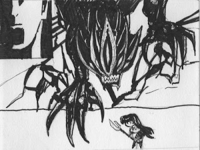
Majority of this is me explaining how the GD's head works. Basically the petal-spike-thingies are somewhat mobile in and as themselves, and the mouth has some... configurability, as well. I believe each fang is actually mounted on a separate leg. the "teeth" showing with it's mouth closed are actually chitinous plates and... and I'm out of thought.

That reminds me, pages 17-18 of chapter 1 show how the GD is getting smaller... it's rougly ten times larger than the space worm-thing it eats first, and afterwards it's still huge compared to the ocular spider... after which it's HEAD is still roughly the size of an oozaru, which are, as you know, not... not very small.

All this just to make it fit, somehow reasonably, into frames together with Queen Serenity, and it's still probably too small here. Oh, well.

Sunday, March 11, 2007

Doodling #4 - in train on way back


...TOTAL randomness!
Not much to say. Um. I like the ^_^

Things:
  • Animation - Plastic Animation Paper
  • D and D - grappling rules are argh. WoW is evil waste of time, unlike DnD. So there.
  • Linux - Ubuntu, of course, but I also like DSL, and Zenwalk.
  • ReactOS is not mature
  • Vista... is not completely horrible. You can change display drivers without rebooting... Which would seem to hint that it runs on a microkernel FWIW.
  • Gunnerkrigg Court
  • Guardians of Order Fan Forums
In the future... there are things....

Saturday, March 10, 2007

doodling #3 / to be continued


Randomness...
First of all, pci=nommconf. That's kinda important, trust me.
In other news, Vista is pretty, but pointless, and ReactOS is not mature enough.
Why does 'Vista' pass spell-check, though... I'll never know.

In any case, no good reason. Five out of Nine.

Once again, I seem to be looking for something, without knowing what it is. I am finding something in the black-and-white line - it forces a discipline on me... or something. I haven't reached it, yet, though.

Perhaps it's the quality I was at, back when I posted stuff on the old forums. I liked those quite a bit, actually. This, for an example---
Which reminds me, floating PHP is scary... one can never be sure where that will point in the future.

Oh, and... I'll upload all of Something2006 after I can be sure they don't contain any more spoilers.

I'm kinda picky when it comes to spoilers. Such an annoying character trait.

Thursday, March 8, 2007

Sailor Nuke / Blargh.


As you know, designs change - especially if one spends three years between initial draft and the actual appereance of a page. My drawing skills have both evolved and devolved in that time period, all depending on the point of view.

Thank you, Alec Guinness.

In any case, S. N. has changed quite a bit, really. You saw her already in her original guise in Iteration 1. I went hunting for the oldest drawing, but I cannot really say which one it is.

The new version is also quite neat, so I'm not exactly unhappy with that change. I did like the knee pads and the boots on the old one, though. I may need to re-incorporate them.

... You know, as a non-native English user, I oftentimes have no idea if I'm making any sense.

In any case, even Sailor Nuke was easier than Sailor Kawaii.... But, that's a topic for another post, due to the Blargh.

"How hard can installing Linux be?"
Hard.

Y'know, labels are... sometimes obvious, often times, not so much. I mean, this one --
nettg-related, definitely. Making-of? Maybe? Should I use the Comic label? Is that actually even used anywhere? No idea....

Tuesday, March 6, 2007

doodling #2


Hmm. weird character, some pondering on 3d-ness of GD's head, plus total randomness.
Junk, junk, junk.

Not as much going on here as in the first one. I was mauled by a random accountant. That's my excuse and I'm sticking to it.

Monday, March 5, 2007

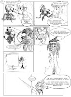
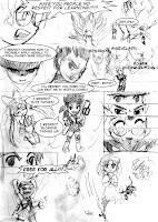
Iteration 1 / Making Of #2

No big top image this time. In any case, this is the "official" Monday post, and the previous one is the "Official" Sunday post, so there!

Iteration 1 was my attempt to quickly reach the end of chapter 1 back in 2004. These are the pages created back then. 01-17 and 01-18 were used practically as-is. Parts after that went through some significant changes.


In any case, they do have some good ideas I'm still somewhat fond of, so here they are.

When talking of the Galactic Destroyer, using it requires so much CG-work later on, one might make a joke about blue screens and special effect budget, to continue the metaphor of a live action TV show for the webcomic. But I won't, right now, because I can't think of anything. So there. Urrr....

01-19 was replaced by this version, which isn't that bad, either. Plus, I like how the official version shows a bit more of the Galactic Destroyer's evolution.

Never-the-less, I like the extreme perspective view of QS, and the GD getting blown away --- I was probably watching Fullmetal Alchemist at the time. Also, the GD in the second frame is nice.


You have seen 01-20 before. As I mentioned before, I quite like the chibi-drawings in the middle, and the background action - Saturn chasing the Chibi-GD - in the last one. Beyond that, it's kinda weak.

The last frame has a distinct foreground-background thing going on, though, which is nice.


01-21 is sort-of a new page! Except that it was effectively rolled to 01-20, plus the dialogue is kinda weird there. I like the angry Science-Terra with GD-aura, and the "Final Planet-wide solution" thing. Also, there are older designs for Sailor Kawaii and Sailor Nuke.

I liked the "Free For All!" thing so much I had to put it into the actual page, too -- even if it's practically invisible.

So... What do you think? Is the official version the better one, or did you find this version of our exposition explosion to be the more entertaining one?

Doodling / I wonder if this will be #1 of doodles?


I so do have a good reason for Saturday: I woke up after noon - no good reason for that - and after breakfast and such, I went and ran D&D for nine hours.

Sketchydoodles. Two things I like here, feel free to guess what they are.

Okay, so... technically it's Monday. But the day doesn't really change 'til I get sleep... does it?
Black ballpoint... Nicely flowing and unforgiving for errors, which teaches... something or other.
I don't generally use eraser all that much in the first place, but still...

Friday, March 2, 2007

Something pointless for today / away

...
Dunno, just wanted to paint-paint something.

News: I will be away for the next nine days. Well, sorta. I'll be at my parent's place which has a decent computer system and a 512K connection - AND a scanner. So, I really won't have an excuse for not posting something every day. I've already prepared two comic-related posts, but I should be able to do some pencil stuff, in any case...

However, I'm flaky. It may be that I won't, and there probably won't be a good reason for it, so I thought I should warn you beforehand.

I did draw something else besides that thing up there, too... but it was so awful, I'd rather forget it for now. Drawings have the habit of looking better after you leave them be for a while.

Thursday, March 1, 2007

Terra's Green Dress / links / pondering

You know, I didn't save once while I was drawing this. Eep. Good thing nothing bad happened...
In any case, as I was going through my old stuff, I noticed there's actually been three different ways I've drawn the dress. The leftmost one is the "most official", considering it's on Ch1 cover.
Some variation of the rightmost one may make an appereance in the distant future.

Random Linkage: Blog from the maker / s of Puffy AmiYumi show - 'twas done in Flash. Keen.
CCC City: at least "Rush II" has pretty good animation.
Cross-linkage: New rant at nettg.com with anoter link I'm too lazy to duplicate here.

*edit* I just had to add this: Shoo Fly.

Concerning the next page, here's something I wrote in an Email, I thought I could show it here, since, it has no spoilers... well, besides the fact that my current layout has six frames for the next page.

I'm tempted to split this page in two. it's better to have two pages with three frames than one page with six frames, IMO... although that does depend on the action.

Frankly, I think we can decompress here a bit, we could have an entire page with just Laios wandering. Ummm... >_<; Four or five frames is usually the optimum. When showing cool stuff, 1-3 frames is best. Part of the reason the previous page turned out as it did, was because due to my slow pace, the script has gotten "compressed" - which doesn't really help. The more stuff is crammed into a page, the harder it's to even _start_ drawing it. On the other hand, decompress too much, and you end with hardly any dialogue and ten pages where hardly anything happens. While this may work for stuff like Yokohama Kaidashi Kikou, it doesn't really for a webcomic, especially with my slow pace. There needs to be a POINT to every page. This can basically be solved only by very good storytelling and pacing... demanding, on it's own, that, too.

something exceedingly simple

looks like 'kaki. Actually OpenCanvas.

I may have a fever.

*edit* Awesomeness, or "That's done in Flash? O_o;"